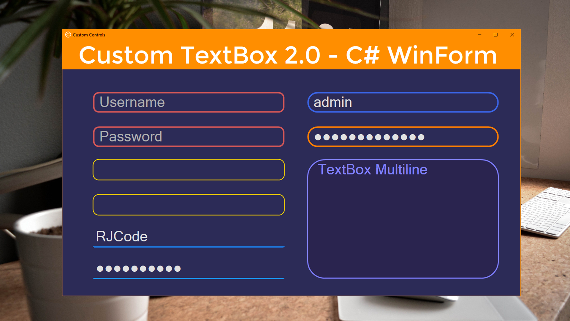
Hola, en este tutorial crearemos un TextBox personalizado con esquinas redondeadas suaves, estilo rectangular y subrayado, color y tamaño de borde, color de texto, y poder establecer un marcador de posición, donde el texto debe obtenerse de forma natural, ya sea campo de contraseña o no.
Bueno empecemos con el tutorial:
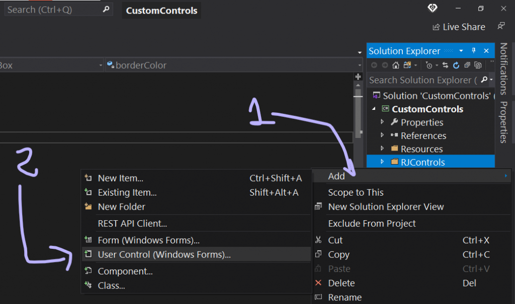
1.- Agregar Control de Usuario
Primeramente debemos agregar un control de usuario para crear el cuadro de texto personalizado a través del diseñador y código. O puedes agregar una clase y heredar de la clase de control de usuario y crear el cuadro de texto personalizado solamente mediante código.
2.- Diseñar la apariencia básica – Diseñador
Luego de haber agregado el UserControl, inicializa las siguientes propiedades: En la propiedad AutoScaleMode establecer en ninguno, y un Padding de 7 en Arriba y abajo, y 10 en izquierda y derecha , esto es muy importante ya que ayudará a que el cuadro de texto quede centrado en el control de usuario. Cambiar el tamaño del control de usuario a un ancho de 250 y un alto de 30. Opcionalmente establecer el color de fondo, color de texto y aumentaremos el tamaño de texto.
2.1.- Agregar TextBox
Luego de haber inicializado las propiedades anteriores, ya solamente queda agregar un cuadro de texto al control de usuario y establecer la propiedad Dock del cuadro de texto en FILL, para encajar en todo el control de usuario. Y finalmente quitar el borde del cuadro de texto. De esta manera el cuadro de texto queda centrado en el control de usuario, gracias al Padding establecido anteriormente.

-Transcripción del código – RJTextBox.Designer.cs
#region Component Designer generated code
/// <summary>
/// Required method for Designer support - do not modify
/// the contents of this method with the code editor.
/// </summary>
private void InitializeComponent()
{
    this.textBox1 = new System.Windows.Forms.TextBox();
    this.SuspendLayout();
    //
    // textBox1
    //
    this.textBox1.BorderStyle = System.Windows.Forms.BorderStyle.None;
    this.textBox1.Dock = System.Windows.Forms.DockStyle.Fill;
    this.textBox1.Location = new System.Drawing.Point(10, 7);
    this.textBox1.Name = "textBox1";
    this.textBox1.Size = new System.Drawing.Size(230, 15);
    this.textBox1.TabIndex = 0;
    this.textBox1.Click += new System.EventHandler(this.textBox1_Click);
    this.textBox1.TextChanged += new System.EventHandler(this.textBox1_TextChanged);
    this.textBox1.Enter += new System.EventHandler(this.textBox1_Enter);
    this.textBox1.KeyPress += new System.Windows.Forms.KeyPressEventHandler(this.textBox1_KeyPress);
    this.textBox1.Leave += new System.EventHandler(this.textBox1_Leave);
    this.textBox1.MouseEnter += new System.EventHandler(this.textBox1_MouseEnter);
    this.textBox1.MouseLeave += new System.EventHandler(this.textBox1_MouseLeave);
    //
    // RJTextBox
    //
    this.AutoScaleMode = System.Windows.Forms.AutoScaleMode.None;
    this.BackColor = System.Drawing.SystemColors.Window;
    this.Controls.Add(this.textBox1);
    this.Font = new System.Drawing.Font("Microsoft Sans Serif", 9.5F, System.Drawing.FontStyle.Regular, System.Drawing.GraphicsUnit.Point, ((byte)(0)));
    this.ForeColor = System.Drawing.Color.FromArgb(((int)(((byte)(64)))), ((int)(((byte)(64)))), ((int)(((byte)(64)))));
    this.Margin = new System.Windows.Forms.Padding(4);
    this.Name = "RJTextBox";
    this.Padding = new System.Windows.Forms.Padding(10, 7, 10, 7);
    this.Size = new System.Drawing.Size(250, 30);
    this.ResumeLayout(false);
    this.PerformLayout();
}
#endregion

private System.Windows.Forms.TextBox textBox1;
3.- Declarar campos – Código
Una vez hecho el diseño básico del cuadro de texto personalizado, ahora ya solo queda abrir el Código del control de usuario y hacer el resto, y como es de costumbre, declararemos algunos campos para la apariencia e inicializar sus valores predeterminados. En este caso, un campo para el color de borde, un campo para el tamaño de borde, y un campo para el estilo del cuadro de texto, es decir un estilo de borde subrayado o rectangular, color y texto de marcador de posición, radio de borde, y un campo para determinar si el cuadro de texto es un campo de contraseña.
    //Fields
    private Color borderColor = Color.MediumSlateBlue;
    private Color borderFocusColor = Color.HotPink;
    private int borderSize = 2;
    private bool underlinedStyle = false;
    private bool isFocused = false;

    private int borderRadius = 0;
    private Color placeholderColor = Color.DarkGray;
    private string placeholderText = "";
    private bool isPlaceholder = false;
    private bool isPasswordChar = false;
4.- Métodos privados
- Crearemos un método para establecer el marcador de posición, y otro método para removerlo.
- Un método para obtener la ruta de gráficos del control con esquinas redondeados.
- Un método para establecer la region redondeada del TextBox interno.
- Finalmente, un método que se encargará de establecer una altura adecuada al control de usuario(RJTextBox) y cuadro de texto (textBox1), y además de restringir el cambio de altura cuando el cuadro de texto no sea multilínea (textBox1.Multiline=false).
#region -> Private methods
private void SetPlaceholder()
{
    if (string.IsNullOrWhiteSpace(textBox1.Text) && placeholderText != "")
    {
        isPlaceholder = true;
        textBox1.Text = placeholderText;
        textBox1.ForeColor = placeholderColor;
        if (isPasswordChar)
            textBox1.UseSystemPasswordChar = false;
    }
}
private void RemovePlaceholder()
{
    if (isPlaceholder && placeholderText != "")
    {
        isPlaceholder = false;
        textBox1.Text = "";
        textBox1.ForeColor = this.ForeColor;
        if (isPasswordChar)
            textBox1.UseSystemPasswordChar = true;
    }
}
private GraphicsPath GetFigurePath(Rectangle rect, int radius)
{
    GraphicsPath path = new GraphicsPath();
    float curveSize = radius * 2F;

    path.StartFigure();
    path.AddArc(rect.X, rect.Y, curveSize, curveSize, 180, 90);
    path.AddArc(rect.Right - curveSize, rect.Y, curveSize, curveSize, 270, 90);
    path.AddArc(rect.Right - curveSize, rect.Bottom - curveSize, curveSize, curveSize, 0, 90);
    path.AddArc(rect.X, rect.Bottom - curveSize, curveSize, curveSize, 90, 90);
    path.CloseFigure();
    return path;
}
private void SetTextBoxRoundedRegion()
{
    GraphicsPath pathTxt;
    if (Multiline)
    {
        pathTxt = GetFigurePath(textBox1.ClientRectangle, borderRadius - borderSize);
        textBox1.Region = new Region(pathTxt);
    }
    else
    {
        pathTxt = GetFigurePath(textBox1.ClientRectangle, borderSize * 2);
        textBox1.Region = new Region(pathTxt);
    }
    pathTxt.Dispose();
}
private void UpdateControlHeight()
{
    if (textBox1.Multiline == false)
    {
        int txtHeight = TextRenderer.MeasureText("Text", this.Font).Height + 1;
        textBox1.Multiline = true;
        textBox1.MinimumSize = new Size(0, txtHeight);
        textBox1.Multiline = false;

        this.Height = textBox1.Height + this.Padding.Top + this.Padding.Bottom;
    }
}
#endregion
5.- Crear los descriptores de acceso – Propiedades
Generamos propiedades para exponer los campos definidos anteriormente, y además de agregar otras propiedades de apariencia (Color de fondo, texto…) y exponer las propiedades funcionales y necesarios para un cuadro de texto (PasswordChar, Multiline, Text…).
    #region -> Properties
    [Category("RJ Code Advance")]
    public Color BorderColor
    {
        get { return borderColor; }
        set
        {
            borderColor = value;
            this.Invalidate();
        }
    }

    [Category("RJ Code Advance")]
    public Color BorderFocusColor
    {
        get { return borderFocusColor; }
        set { borderFocusColor = value; }
    }

    [Category("RJ Code Advance")]
    public int BorderSize
    {
        get { return borderSize; }
        set
        {
            if (value >= 1)
            {
                borderSize = value;
                this.Invalidate();
            }
        }
    }

    [Category("RJ Code Advance")]
    public bool UnderlinedStyle
    {
        get { return underlinedStyle; }
        set
        {
            underlinedStyle = value;
            this.Invalidate();
        }
    }

    [Category("RJ Code Advance")]
    public bool PasswordChar
    {
        get { return isPasswordChar; }
        set
        {
            isPasswordChar = value;
            if (!isPlaceholder)
                textBox1.UseSystemPasswordChar = value;
        }
    }

    [Category("RJ Code Advance")]
    public bool Multiline
    {
        get { return textBox1.Multiline; }
        set { textBox1.Multiline = value; }
    }

    [Category("RJ Code Advance")]
    public override Color BackColor
    {
        get { return base.BackColor; }
        set
        {
            base.BackColor = value;
            textBox1.BackColor = value;
        }
    }

    [Category("RJ Code Advance")]
    public override Color ForeColor
    {
        get { return base.ForeColor; }
        set
        {
            base.ForeColor = value;
            textBox1.ForeColor = value;
        }
    }

    [Category("RJ Code Advance")]
    public override Font Font
    {
        get { return base.Font; }
        set
        {
            base.Font = value;
            textBox1.Font = value;
            if (this.DesignMode)
                UpdateControlHeight();
        }
    }

    [Category("RJ Code Advance")]
    public string Texts
    {
        get
        {
            if (isPlaceholder) return "";
            else return textBox1.Text;
        }
        set
        {
            textBox1.Text = value;
            SetPlaceholder();
        }
    }

    [Category("RJ Code Advance")]
    public int BorderRadius
    {
        get { return borderRadius; }
        set
        {
            if (value >= 0)
            {
                borderRadius = value;
                this.Invalidate();//Redraw control
            }
        }
    }

    [Category("RJ Code Advance")]
    public Color PlaceholderColor
    {
        get { return placeholderColor; }
        set
        {
            placeholderColor = value;
            if (isPlaceholder)
                textBox1.ForeColor = value;
        }
    }

    [Category("RJ Code Advance")]
    public string PlaceholderText
    {
        get { return placeholderText; }
        set
        {
            placeholderText = value;
            textBox1.Text = "";
            SetPlaceholder();
        }
    }
    #endregion
6.- Anular y extender métodos de evento – UserControl
Será necesario anular el método de evento OnPaint para dibujar el borde de estilo rectangular o subrayado, y las esquinas redondeadas del cuadro de texto personalizado, anular el método de evento OnResize para establecer el alto adecuado del control cada vez que este cambie de tamaño en tiempo de diseño. Finalmente anular el método de evento OnLoad para dar el toque final y establecer el alto adecuado en tiempo de ejecución.
#region -> Overridden methods
protected override void OnResize(EventArgs e)
{
    base.OnResize(e);
    if (this.DesignMode)
        UpdateControlHeight();
}
protected override void OnLoad(EventArgs e)
{
    base.OnLoad(e);
    UpdateControlHeight();
}
protected override void OnPaint(PaintEventArgs e)
{
    base.OnPaint(e);
    Graphics graph = e.Graphics;

    if (borderRadius > 1)//Rounded TextBox
    {
        //-Fields
        var rectBorderSmooth = this.ClientRectangle;
        var rectBorder = Rectangle.Inflate(rectBorderSmooth, -borderSize, -borderSize);
        int smoothSize = borderSize > 0 ? borderSize : 1;

        using (GraphicsPath pathBorderSmooth = GetFigurePath(rectBorderSmooth, borderRadius))
        using (GraphicsPath pathBorder = GetFigurePath(rectBorder, borderRadius - borderSize))
        using (Pen penBorderSmooth = new Pen(this.Parent.BackColor, smoothSize))
        using (Pen penBorder = new Pen(borderColor, borderSize))
        {
            //-Drawing
            this.Region = new Region(pathBorderSmooth);//Set the rounded region of UserControl
            if (borderRadius > 15) SetTextBoxRoundedRegion();//Set the rounded region of TextBox component
            graph.SmoothingMode = SmoothingMode.AntiAlias;
            penBorder.Alignment = System.Drawing.Drawing2D.PenAlignment.Center;
            if (isFocused) penBorder.Color = borderFocusColor;

            if (underlinedStyle) //Line Style
            {
                //Draw border smoothing
                graph.DrawPath(penBorderSmooth, pathBorderSmooth);
                //Draw border
                graph.SmoothingMode = SmoothingMode.None;
                graph.DrawLine(penBorder, 0, this.Height - 1, this.Width, this.Height - 1);
            }
            else //Normal Style
            {
                //Draw border smoothing
                graph.DrawPath(penBorderSmooth, pathBorderSmooth);
                //Draw border
                graph.DrawPath(penBorder, pathBorder);
            }
        }
    }
    else //Square/Normal TextBox
    {
        //Draw border
        using (Pen penBorder = new Pen(borderColor, borderSize))
        {
            this.Region = new Region(this.ClientRectangle);
            penBorder.Alignment = System.Drawing.Drawing2D.PenAlignment.Inset;
            if (isFocused) penBorder.Color = borderFocusColor;

            if (underlinedStyle) //Line Style
                graph.DrawLine(penBorder, 0, this.Height - 1, this.Width, this.Height - 1);
            else //Normal Style
                graph.DrawRectangle(penBorder, 0, 0, this.Width - 0.5F, this.Height - 0.5F);
        }
    }
}
#endregion
7.- Crear evento predeterminado del cuadro de texto personalizado
El evento predeterminado de un control de usuario es el evento Load, y el evento predeterminado de un cuadro de texto es el evento TextChanged. Por lo tanto debemos recrear este evento en el cuadro de texto personalizado (RJTextBox), ya que el evento por defecto actual es el evento Load.
Nota: Para saber cual es el evento predeterminado de un control, solamente debes hacer doble clic sobre el control y se creará el método de evento predeterminado.
    [DefaultEvent("_TextChanged")]
    public partial class RJTextBox : UserControl
    {
        //Default Event
        public event EventHandler _TextChanged;

        //TextBox-> TextChanged event
        private void textBox1_TextChanged(object sender, EventArgs e)
        {
            if (_TextChanged != null)
                _TextChanged.Invoke(sender, e);
        }
8.- Cambiar color de borde en modo enfoque & Placeholder
Para ese propósito es necesario cambiar el valor del campo isFocused cuando el cuadro de texto entra en estado enfocado o pierde el foco, de la misma manera establecer o quitar el marcador de posición. Entonces necesitamos suscribir el evento Enter-Focus y Leave-Focus del cuadro de texto y volver a dibujar el control.
private void textBox1_Enter(object sender, EventArgs e)
{
    isFocused = true;
    this.Invalidate();
    RemovePlaceholder();
}
private void textBox1_Leave(object sender, EventArgs e)
{
    isFocused = false;
    this.Invalidate();
    SetPlaceholder();
}
9.- Adjuntar otros eventos existentes comunes
Finalmente es necesario adjuntar los eventos existentes y comunes entre el control de usuario (RJTextBox) y el cuadro de texto (textBox1), por ejemplo el evento Click, KeyPress y entre otros (Solo es recomendable adjuntar los eventos necesarios).
    private void textBox1_Click(object sender, EventArgs e)
    {
        this.OnClick(e);
    }
    private void textBox1_MouseEnter(object sender, EventArgs e)
    {
        this.OnMouseEnter(e);
    }
    private void textBox1_MouseLeave(object sender, EventArgs e)
    {
        this.OnMouseLeave(e);
    }
    private void textBox1_KeyPress(object sender, KeyPressEventArgs e)
    {
        this.OnKeyPress(e);
    }
Bueno eso es todo :), espero que les haya gustado y ayudado a comprender el uso de los controles de usuario junto a otros controles para hacer controles personalizados.
Hasta la próxima. 🖐
Los comentarios están cerrados.